E-commerce · User acquisition flow

Overview
During my six years at Impact Brands, I was part of a team building and evolving direct-to-consumer supplement funnels for multiple brands, including PureHealth Research, one of the company's largest and most established brands.
My role evolved from hands-on UI/UX designer to Senior Designer and eventually Team Lead, meaning I was involved at every level: designing pages from scratch, running design reviews, coordinating A/B test cycles, and maintaining consistency across a growing product catalog.
The Business Context
Supplement e-commerce is a highly competitive, conversion-driven environment. Unlike typical SaaS or product design, every pixel has a measurable commercial impact. Customers arrive skeptical, often from paid ads, and need to be guided through a trust-building journey before they're ready to buy.
The funnel for a product like Lymph System Support followed this structure:
Ad → VSL page → Quiz → Order page
Each stage had a distinct job: the VSL builds emotional resonance and educates, the quiz personalizes and qualifies, the order page converts. Designing these pages meant understanding not just UI patterns, but the psychology of each stage.
My Responsibilities
Designing new product funnels from initial brief to developer handoff
Building and maintaining design systems used across multiple brands
Creating A/B test variants for order forms, pricing displays, CTAs, banners, and page layout elements
Coordinating with marketing, copywriting, IT, and A/B testing teams throughout the process
Reviewing and directing junior designers' work as Team Lead

The Design System Challenge
As the product catalog grew, designing each funnel from scratch became unsustainable. I helped develop a scalable template approach: each brand had its own dedicated design system (components, color styles, typography), but all were built on the same structural logic. When a new brand launched, we duplicated an existing system and adapted it to the new brand's visual identity.
This meant maintaining design consistency across at least 7 brands, each with dozens of products, while keeping each brand visually distinct. New product funnels could be launched significantly faster because the structural decisions were already made. Designers only needed to populate content and adjust brand-specific styling.
A/B Testing Process
Optimization was continuous. Tests were proposed from multiple directions: my team, other internal teams, and a dedicated A/B testing team. My role was to translate test hypotheses into design variants and ensure they were built to spec.
Areas we tested:
Order form layout: element placement, visual hierarchy
Pricing presentation: how discounts and savings were communicated (percentage vs. absolute value, per-bottle vs. total price)
Subscription vs. one-time purchase UI: how to present the choice without cannibalizing one option
Social proof placement: where reviews appeared and in what format
CTAs: copy, color, size, sticky vs. static behavior
Trust elements: guarantee badges, certifications, before/after banners
Winning variants were rolled out across all relevant products and brands, meaning a single well-designed test could impact the entire catalog.

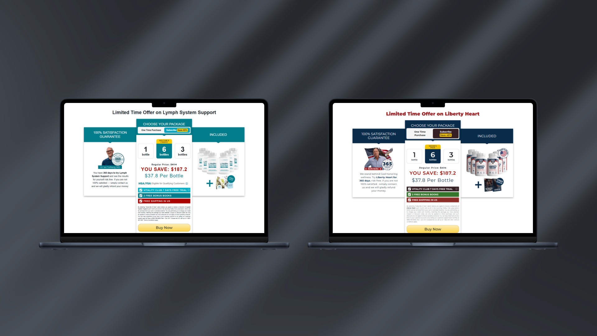
The Order Page: Key Design Decisions
The order page sits at the end of a long trust-building journey. By the time a user lands here, they've watched a video and completed a quiz. They're warm but not yet committed. The design had to close that gap.
Package selection as the first interaction: presenting 1/3/6 bottle options immediately anchors the user in a buying mindset rather than a browsing mindset.
Subscription prominence: the default tab showing subscription pricing with clear savings needed to feel like the obvious choice without feeling manipulative.
Guarantee visibility: the 365-day money-back guarantee needed to be prominent enough to reduce anxiety without distracting from the purchase flow.
Minimal friction: at this stage, every unnecessary element is a potential exit point. The page needed to feel focused and trustworthy simultaneously.

Outcome
The funnel system I contributed to supported the growth of PureHealth Research into one of the brand's strongest-performing product lines. The template system reduced new product launch time and allowed the team to scale without proportionally scaling headcount.
The iterative A/B testing process created a feedback loop between design decisions and real user behavior, something that fundamentally shaped how I think about design: not as a finished artifact, but as a hypothesis to be tested.